BankWise
A more intuitive way to sign up for your new online bank accounts.
Project Overview
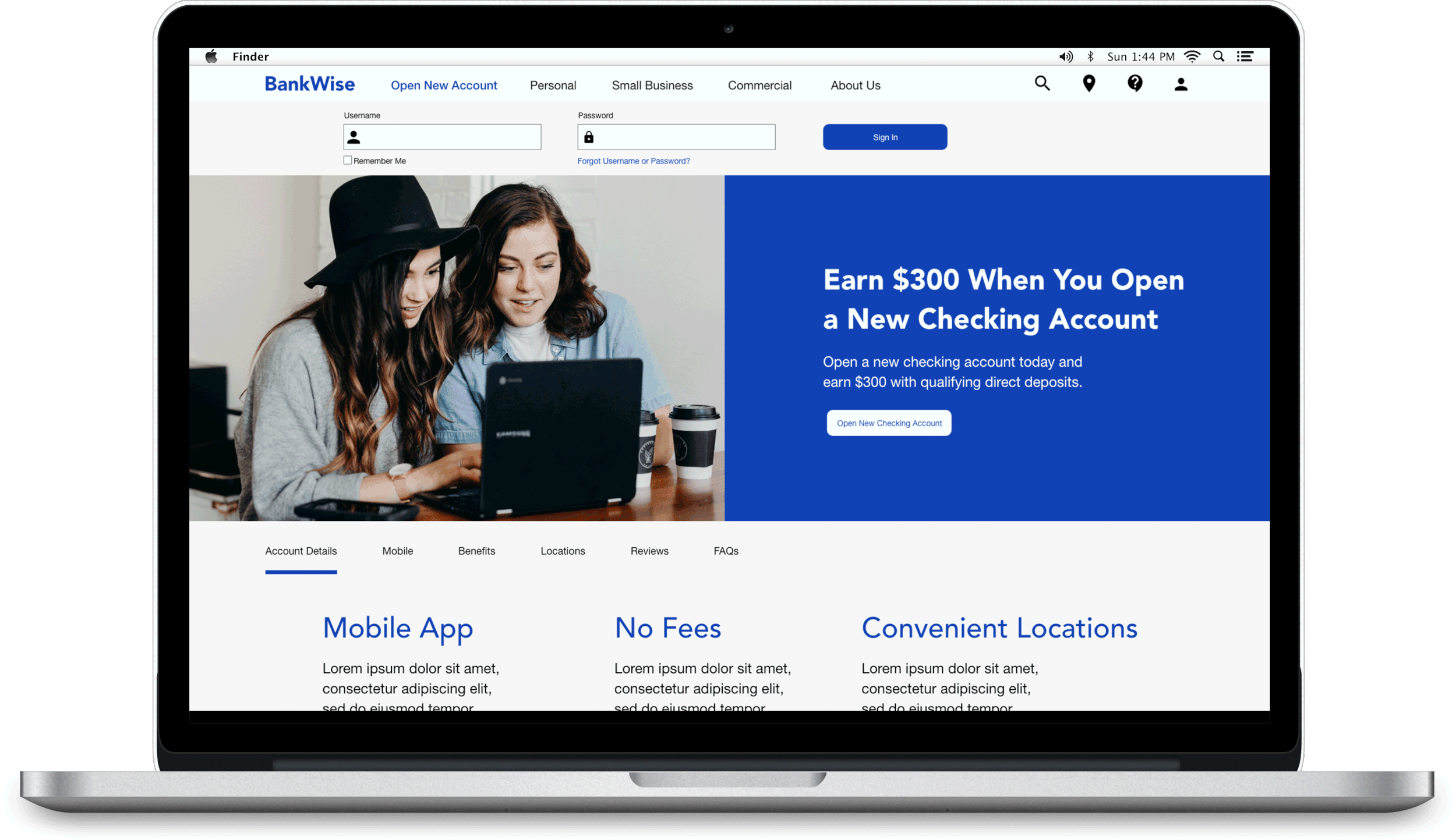
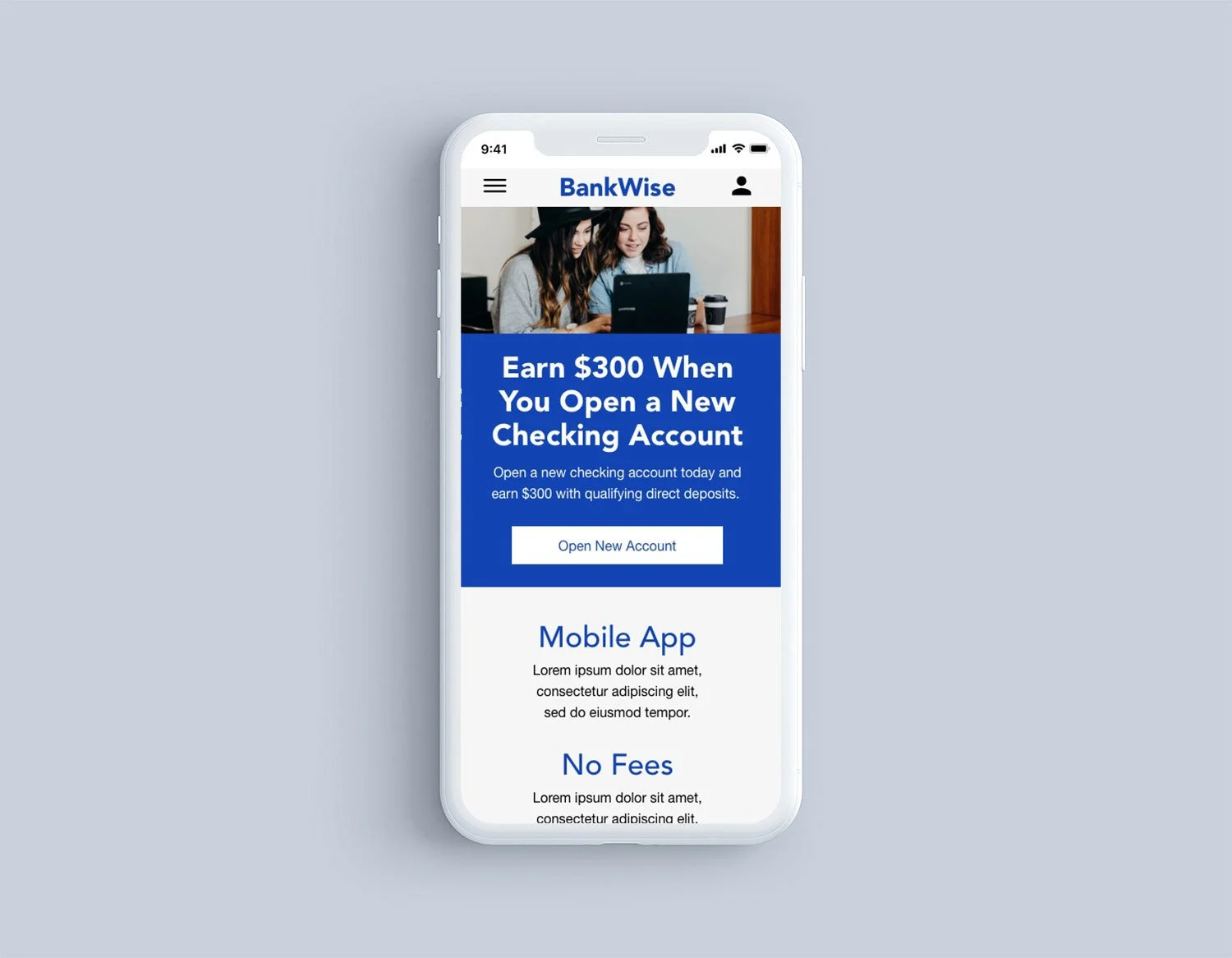
BankWise is a UX banking website and mobile app I created for an effortless user experience to help current and new clients sign up for online bank accounts. Often financial websites lack the intuitiveness to help users create new accounts, which leaves them frustrated and disheartened. With BankWise, user’s can easily locate the “Open New Account” sections on the website and follow through the online sign up process from beginning to end at their own convenience and location without having to physically visit a bank branch or wait for a customer service personnel to help guide them through it all.
Role:
I was responsible for the entire design process, starting from research, conducting interviews, creating flows and wireframes, conducting usability studies, and design iterations.
Tools:
Paper, Sharpie, Adobe Xd, and Photoshop
Understanding the user
-
Research
By conducting user interviews, creating personas, and completing competitive audits, I was able to gain insight on what the end user’s needs and pain points were when they tried to create a new online banking account from beginning to end. All these findings helped guide me through the rest of the project.
-
Objective
Since there are various established financial websites that already exist, the main objective is to build upon what already exists, but make the interface more intuitive for our users.
-
Goal
To have users locate the “Open New Account” section on the BankWise website and follow through the sign up process until they have successfully opened their new online bank account without experiencing difficulties.
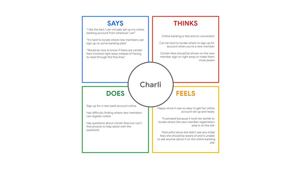
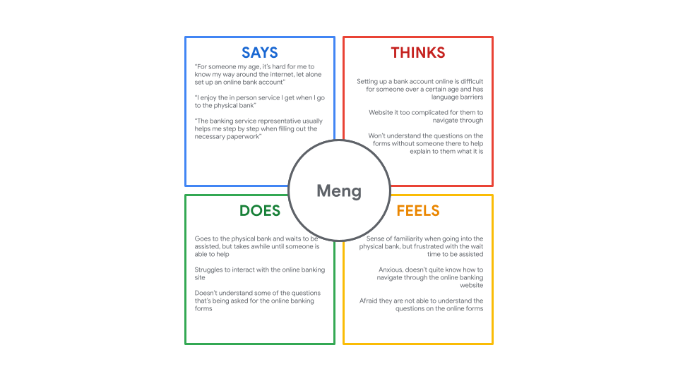
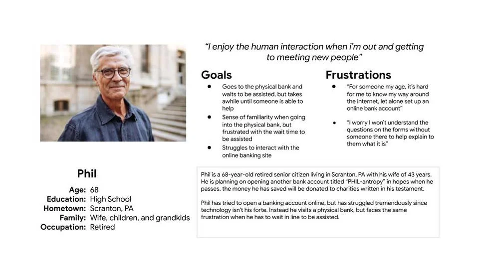
Empathy maps
Empathy maps were created after conducting qualitative user interviews to gain perspective and to keep in focus a user-centered design. By having a list of open ended questions that entails some of their positive and negative experience when they try to open a new online bank account, to asking them what types of challenges they face when they’re going through the process has helped me define pain points and certain user behaviors to concentrate on when building BankWise’s online banking account sign up processes.


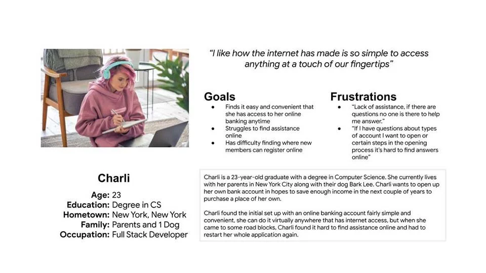
Personas
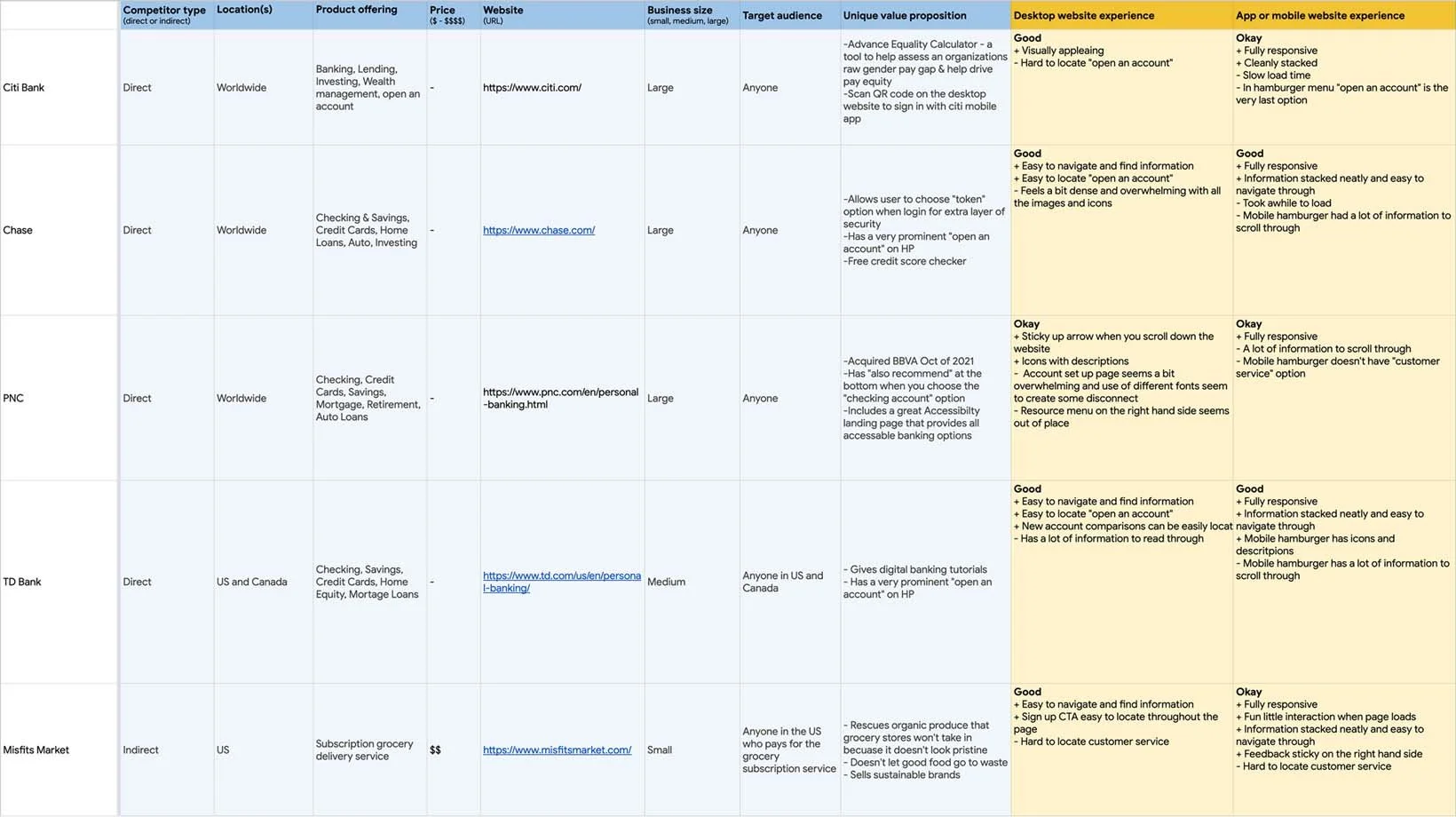
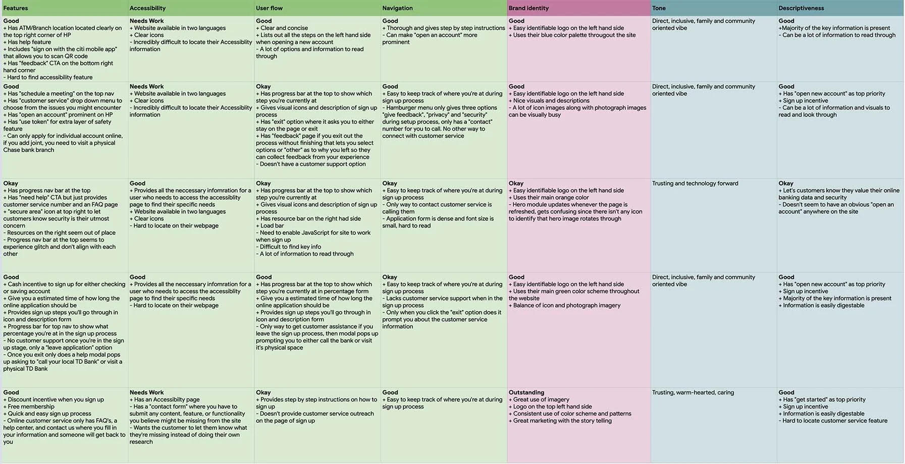
Competitive audit
A competitive audit was conducted in order to gain better insight of the current financial banking online websites sign up processes. The analysis collected from the direct and indirect companies that were audited, I was able to compare the pros and cons of each site. This made me recognize the opportunities to meet the user needs that are being neglected during the online sign up process and gave me the chance to build a better experience for the users.
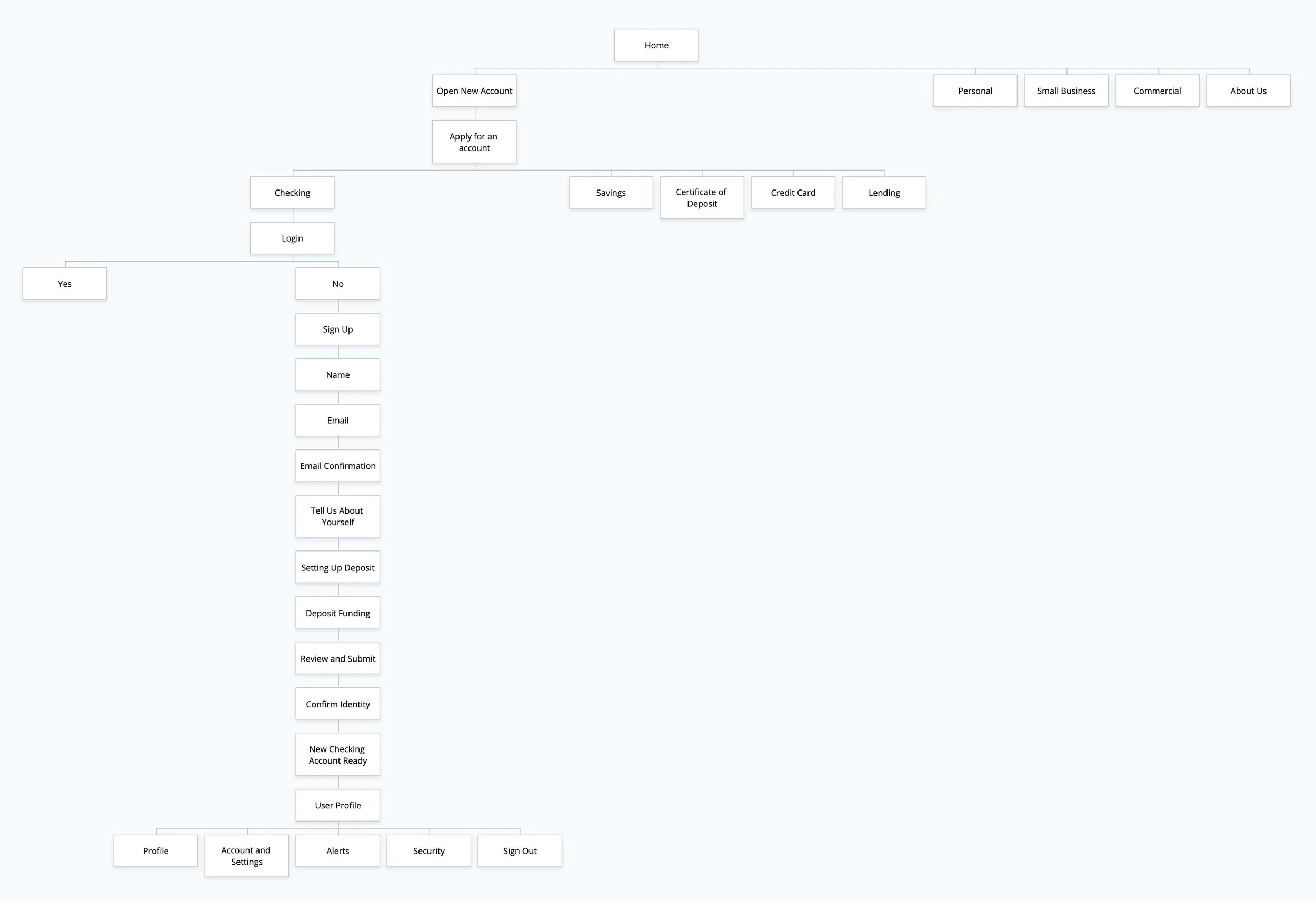
Information architecture
Information architecture was created for the BankWise website to help visualize and organize the overall path a user would take. This would help guide them to what they’re trying to find, which in this case would be “Open New Account”.
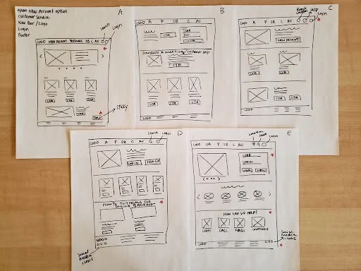
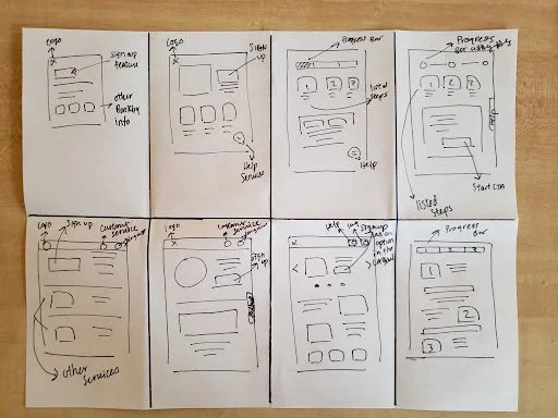
Wireframes
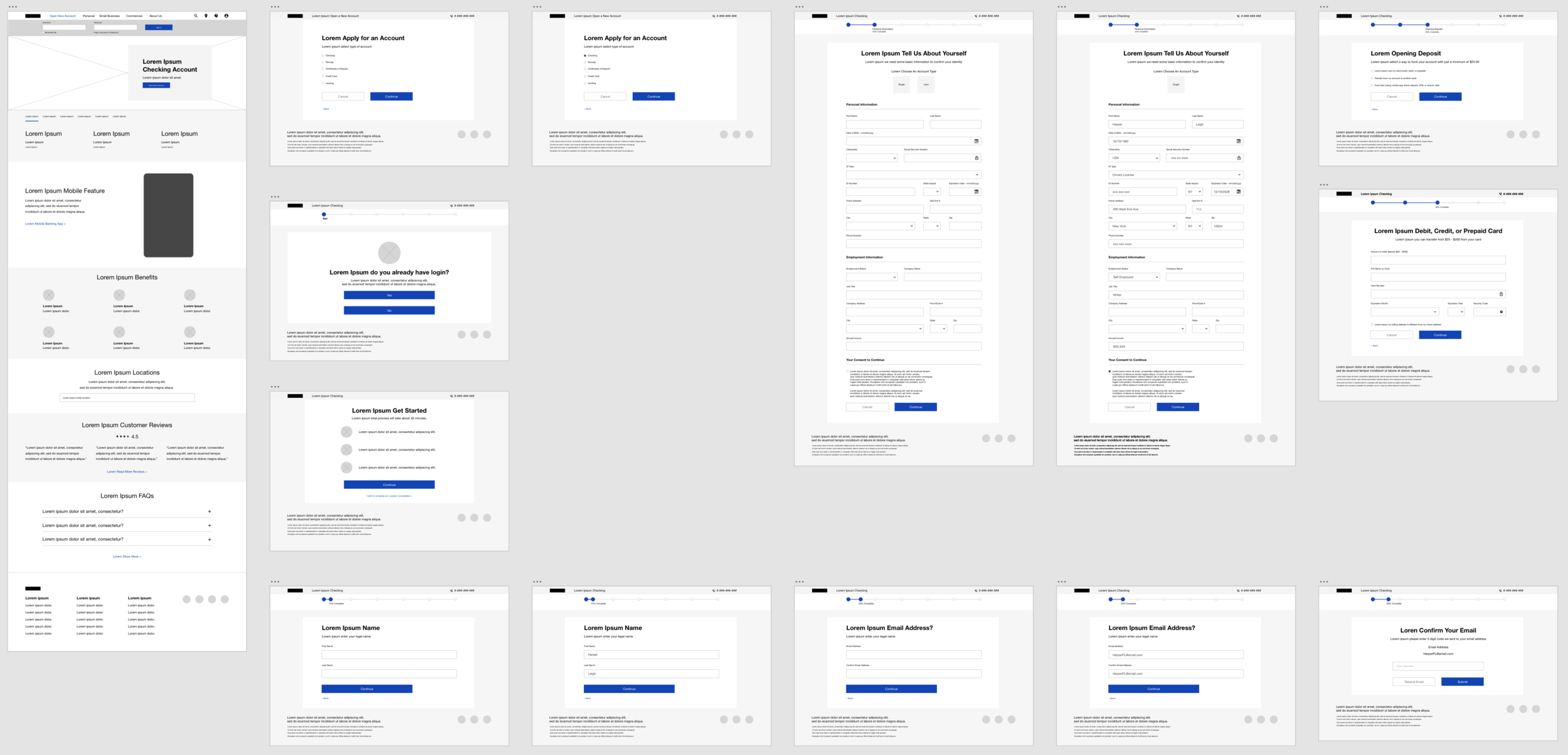
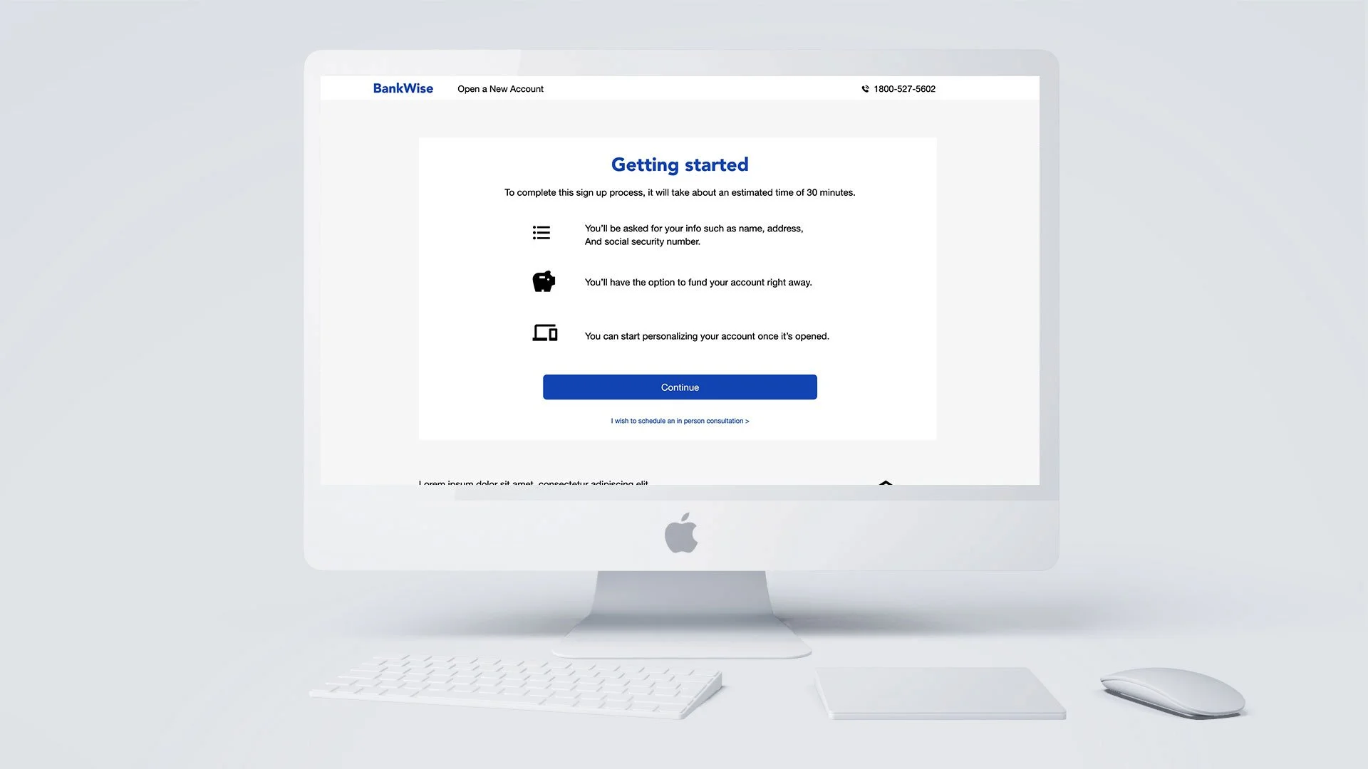
Beginning of the initial design stages, paper wireframes were made by utilizing paper and sharpie to draw out sketches which was necessary for quick ideation processes and explorations. Next, the paper wireframes were translated into low-fidelity digital wireframes designed in Adobe Xd to help create more in-depth details and refine content.
BankWise Low-fidelity digital wireframes Click to view
Usability study
Usability tests were conducted to see whether user’s were able to complete their journey of opening a new bank account on the BankWise low-fidelity prototype. I had 5 participants ranging from 21 - 70 years old, three were unmoderated and two were moderated completed at the participant’s residence. Each session ranged from 20 - 30 minutes. For the unmoderated tests, I emailed the participants a list of prompts to follow while having them screen record their click paths. The moderated tests were done in person, where I was able to read them a scripted prompt and record their interactions.
Goal:
Determine if the user can successfully complete the signup process from beginning to end and examine where difficulties might occur for the user during the signup process so improvements can be made to feature iterations.
Research questions:
Can users easily locate where “open new account” is on the website?
Does the progress bar on top of the signup page help indicate how far along they are in the process?
Which parts of the signup process do users have the most difficulty with?
Do user’s find the online signup easy or difficult to complete?
Usability study findings:
Majority of the participants had little to no problem in locating the “Open New Account” section and proceed with the sign up process. Though there were some confusion when it came to the progress bar during the sign up process and UI elements such as a profile image on the low-fidelity prototype. Another issue that arise was during one of the sign up procedures I missed out on the opportunity to create an email verification page once an email as been sent. The feedback collected will greatly help in all feature improvements and designs.
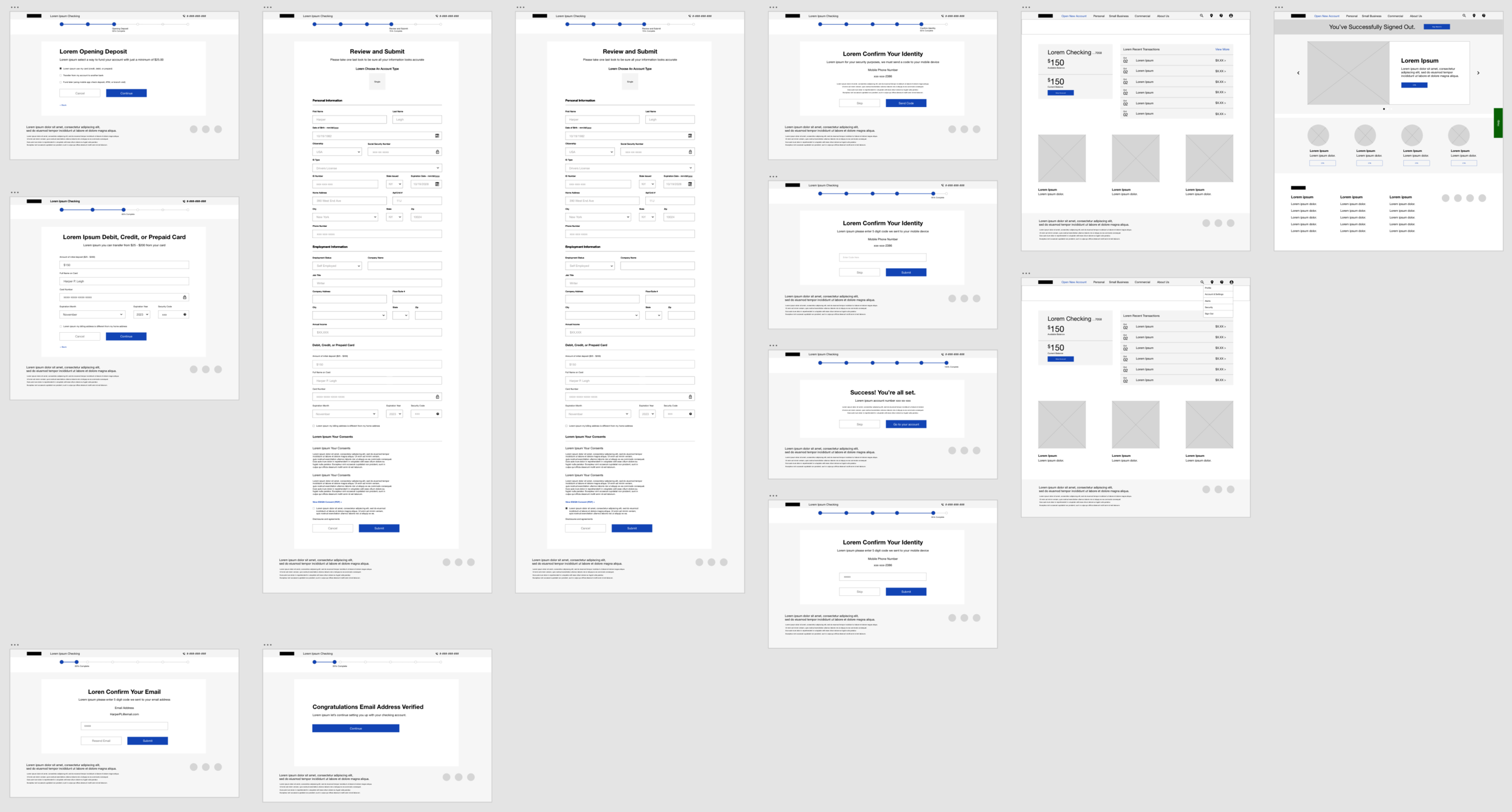
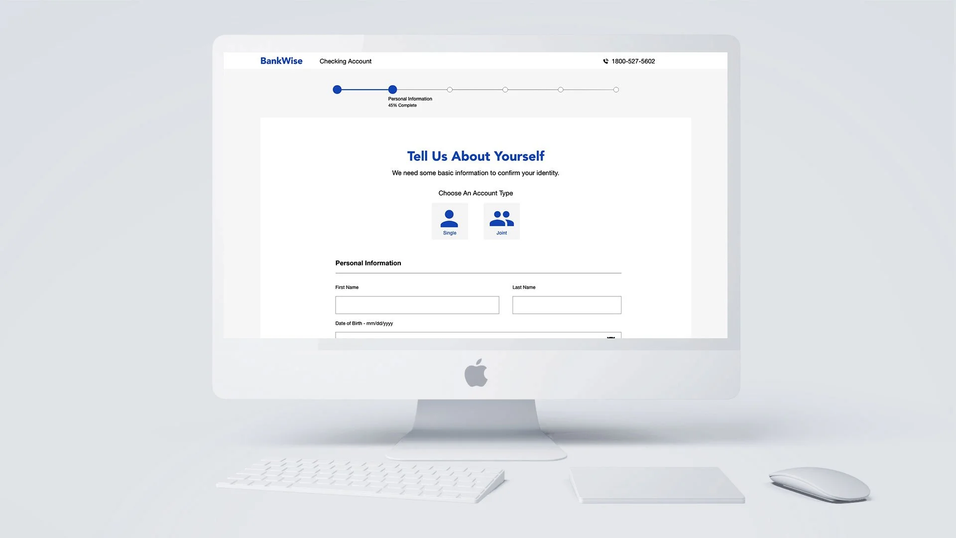
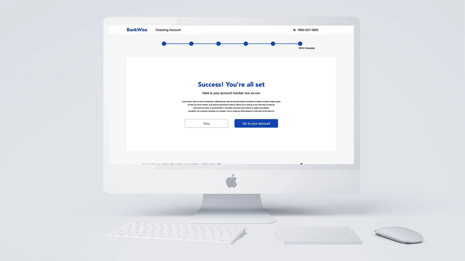
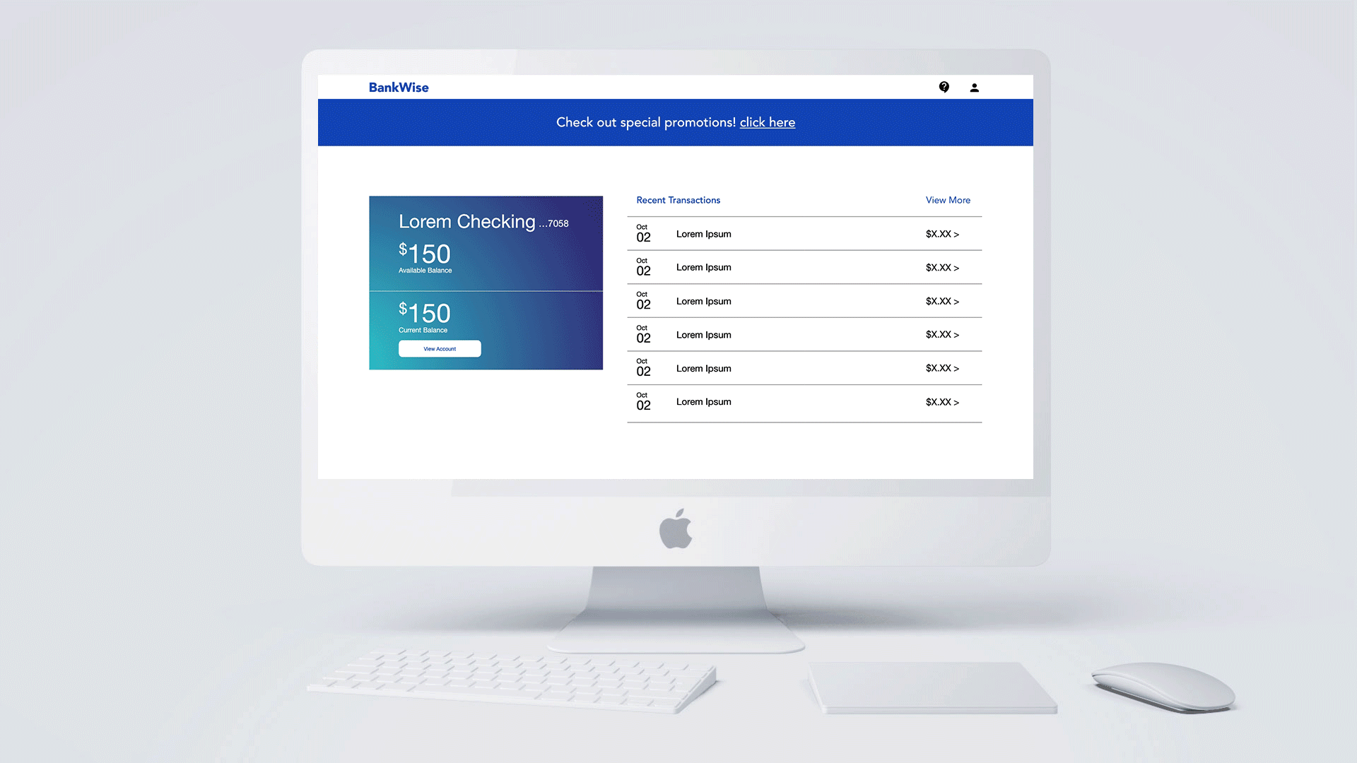
High-fidelity prototype
A high-fidelity prototype and mock-up was created after the usability study. From the users feedback and pain points, I was able improve upon my previous designs in order to address their needs. By prioritizing the research insights from P0 (most urgent) to P2 (least urgent) improvements such as the progress bar on top of the sign up process and email verification confirmation were taken into consideration as P0, while some of the UI elements were placed as P1.
BankWise high-fidelity prototype Click to view

Next steps
1.
See how successful BankWises online banking sign up process is by conducting further usability testing and continuing to iterate on the user experience journey.
2.
For next round of designs, I would also like to create more assistive features such as adding a "help" FAB (floating action button) during the sign up process, so if the user gets stuck at any point, they are able to seek help quickly.

Takeaways
I learned through building the BankWise website that users want to be able to locate what they’re searching for quickly and easily. They also like to be guided through a step by step process when registering for a new account. Instead of having the inconvenience of opening a new account by visiting a local branch or dialing up customer service on the phone, I hope this new sign up process makes it easier, more convenient, and ultimately build the users confidence and empowerment when the visit the BankWise website.